Turning a Minimal Brand Foundation Into a Complete Bilingual Website
RenewBody needed a professional website that could present the brand clearly, credibly, and consistently in two languages.
The starting point was intentionally minimal: a logo and two fonts provided by an external graphic designer.
From that limited foundation, the goal was to create a complete bilingual website that felt polished, coherent, and aligned with the brand — without relying on a full brand manual or an already defined web design system.
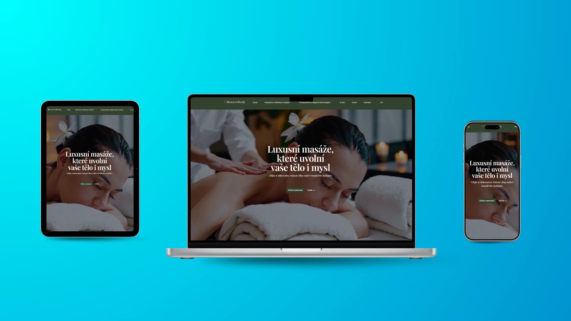
My role covered more than implementation. I translated the available visual identity into a full digital experience, wrote the website copy, and created the hero visual used on the homepage.
The Challenge
RenewBody had the beginnings of a brand identity, but not a complete digital system.
The available inputs were:
- a logo
- two brand fonts
- a basic visual direction from an external graphic designer
That meant the website had to be built from a very limited set of brand assets.
The challenge was not just to “make a website,” but to expand a small visual foundation into a complete and convincing online presence. The website needed to feel intentional, premium, and trustworthy — not like a collection of disconnected design decisions.
At the same time, the site had to work bilingually, which meant both language versions needed to feel equally natural and well-structured.
The challenge was to:
The Solution
I created a full bilingual website for RenewBody based on the existing logo and typography direction.
Instead of treating the minimal brand assets as a limitation, I used them as the foundation for the website’s complete visual and content system. The logo and fonts defined the tone of the brand, and from there I developed the website structure, visual hierarchy, layout rhythm, content presentation, and user experience.
I also wrote all of the website copy, making sure the messaging matched the desired tone of the brand and supported a clear, professional presentation.
For the hero section, I created the main visual using AI in a way that feels natural and premium. The goal was not to create something that looked artificial or generic, but something that integrated seamlessly into the overall website and supported the brand’s atmosphere.
Brand Interpretation
A major part of the project was translating a very limited identity foundation into a usable digital design system.
The external designer provided the logo and typography direction, but the website needed a much broader visual structure in order to feel complete.
This required making decisions around:
- page structure
- spacing and layout rhythm
- typography hierarchy
- section composition
- visual balance
- call-to-action placement
- overall mood and presentation
The final result had to respect the original design direction while expanding it into a practical and cohesive website experience.
Bilingual Website Experience
The website was built as a bilingual experience, allowing RenewBody to communicate clearly with two different audiences.
A bilingual website requires more than translated text. The structure, interface, and layout all need to work naturally in both language versions.
This included making sure that:
- language switching feels clear and accessible
- both language versions stay visually consistent
- content flows naturally in each language
- typography remains readable and elegant
- layout adapts well to different text lengths
- the experience feels equally polished in both versions
This gave RenewBody a broader and more professional digital presence without fragmenting the brand.
Copywriting
I also wrote all of the copy used across the website.
This was an important part of the project because the copy had to do more than simply fill the layout. It needed to define the tone of the brand, explain the offer clearly, and support a calm, premium, and trustworthy overall impression.
The writing focused on:
- clear communication of services
- brand-consistent tone
- readable content structure
- persuasive but natural messaging
- support for both usability and credibility
By handling both structure and content, I was able to make sure the messaging and design worked together as one system.
Hero Visual Creation
I created the hero visual for the homepage using AI.
This was done with a strong focus on quality and realism so the final output would blend naturally into the website and support the overall brand presentation. The goal was not to use AI as a shortcut, but as a production tool to create a visual that matched the website’s aesthetic and looked fully credible in context.
The result is a hero section that feels premium and visually strong without looking artificially generated.
Website Design & Execution
The website was designed to feel clean, elegant, and trustworthy.
Because the starting brand assets were limited, the design needed discipline. Instead of adding unnecessary visual complexity, the website relied on strong typography, consistent spacing, carefully structured sections, and a clear visual hierarchy.
The work focused on:
- complete bilingual website creation
- clear and elegant page structure
- strong visual hierarchy
- responsive design
- clean typography
- mobile-friendly user experience
- polished integration of brand assets
- consistent experience across both language versions
The result is a website that feels complete and intentional, even though the project began with only a small visual foundation.
What Was Delivered
The project included:
- bilingual website creation
- website design based on existing brand assets
- interpretation of logo and typography direction
- expansion of minimal identity into a complete digital system
- full website copywriting
- page structure and content layout
- hero visual creation using AI
- responsive implementation
- language version structure
- mobile optimization
- user experience refinement
- visual consistency across the website
The project combined brand interpretation, website design, copywriting, bilingual UX, and visual production.
The Result
RenewBody gained a complete bilingual website built from a minimal brand foundation.
The final website gives the brand a professional digital presence that feels coherent, polished, and aligned with the original visual direction. Instead of requiring a full design system before moving forward, the project turned a logo and two fonts into a complete online experience.
By combining website design, copywriting, and the creation of a high-quality hero visual, the final result feels fully developed and ready for real users.
Key Takeaway
A brand does not always need a complete visual system before it can move online.
Sometimes the real value lies in being able to take a small foundation and turn it into a complete digital experience.
For RenewBody, I turned a logo, two fonts, and a basic visual direction into a full bilingual website — including the copy and the hero visual — creating a polished digital presence that feels intentional from top to bottom.